Two-Tone Kitchen Cabinets: 5 Color Ideas That Work in Dayton Homes
Two-Tone Kitchen Cabinets: Color Ideas We Actually Use in Dayton Homes
Two-tone kitchen cabinets instantly elevate a space from "standard" to custom-designed. By mixing two complementary colors, you create depth, balance, and personality without a full remodel.
At Craft & Revive, we've painted dozens of two-tone kitchens across Dayton, Kettering, Beavercreek, and Centerville. Whether it's classic white uppers with sage green lowers or a navy island against neutral cabinets, this approach works beautifully in real homes. Here's what we've learned actually looks good long-term.
What Makes Two-Tone Cabinets Work
Two-tone simply means using two different colors or finishes within the same kitchen, most commonly:
Light uppers + darker lowers
Neutral perimeter + contrasting island
Painted cabinets + wood accents
The contrast adds visual interest and solves common kitchen design problems: it makes small spaces feel larger, hides wear on high-touch areas, and creates a more intentional, "designer" look.
Why Two-Tone Kitchens Age Better
Homeowners love two-tone because:
Lighter uppers keep the space bright around eye level
Darker lowers ground the design and hide fingerprints/scratches
Islands become focal points without overwhelming the whole room
Flexible updates — change hardware or add an accent wall years later
Because we use durable 2K cabinet coatings (like in [our paint guide]), these finishes stay crisp and clean even in busy family kitchens.
5 Two-Tone Combos We Recommend for Dayton Homes
These are the pairings that photograph well, wear well, and complement local home styles.
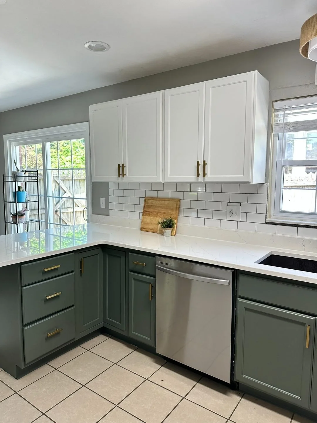
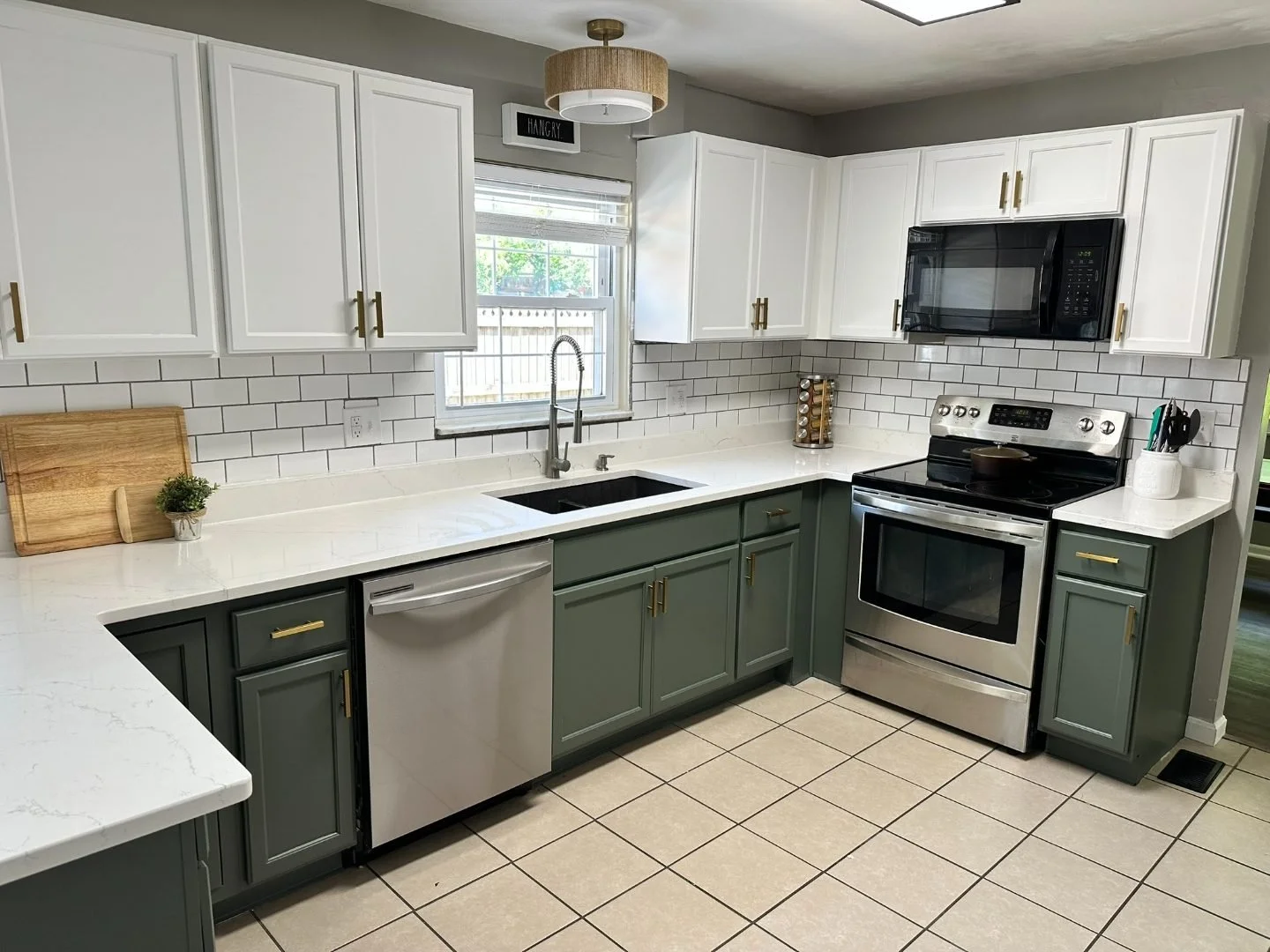
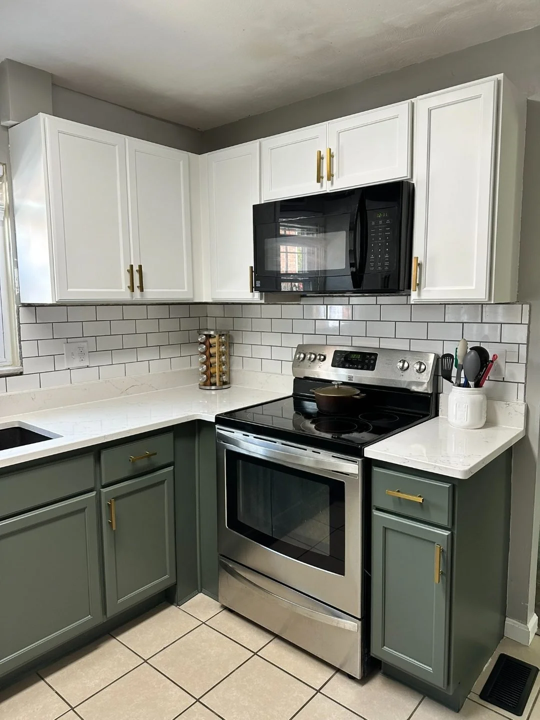
1. White Uppers + Sage Green Lowers
Perfect for: Bright, airy kitchens with wood floors or creamy counters
Clean white cabinets draw the eye upward while sage green bases add organic warmth. This combo hides daily wear beautifully and pairs with brass or black hardware.
[Insert your green kitchen photo here]
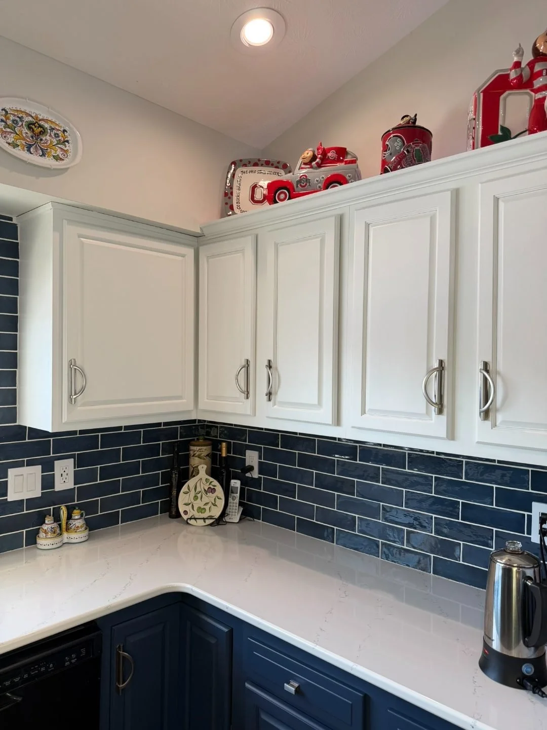
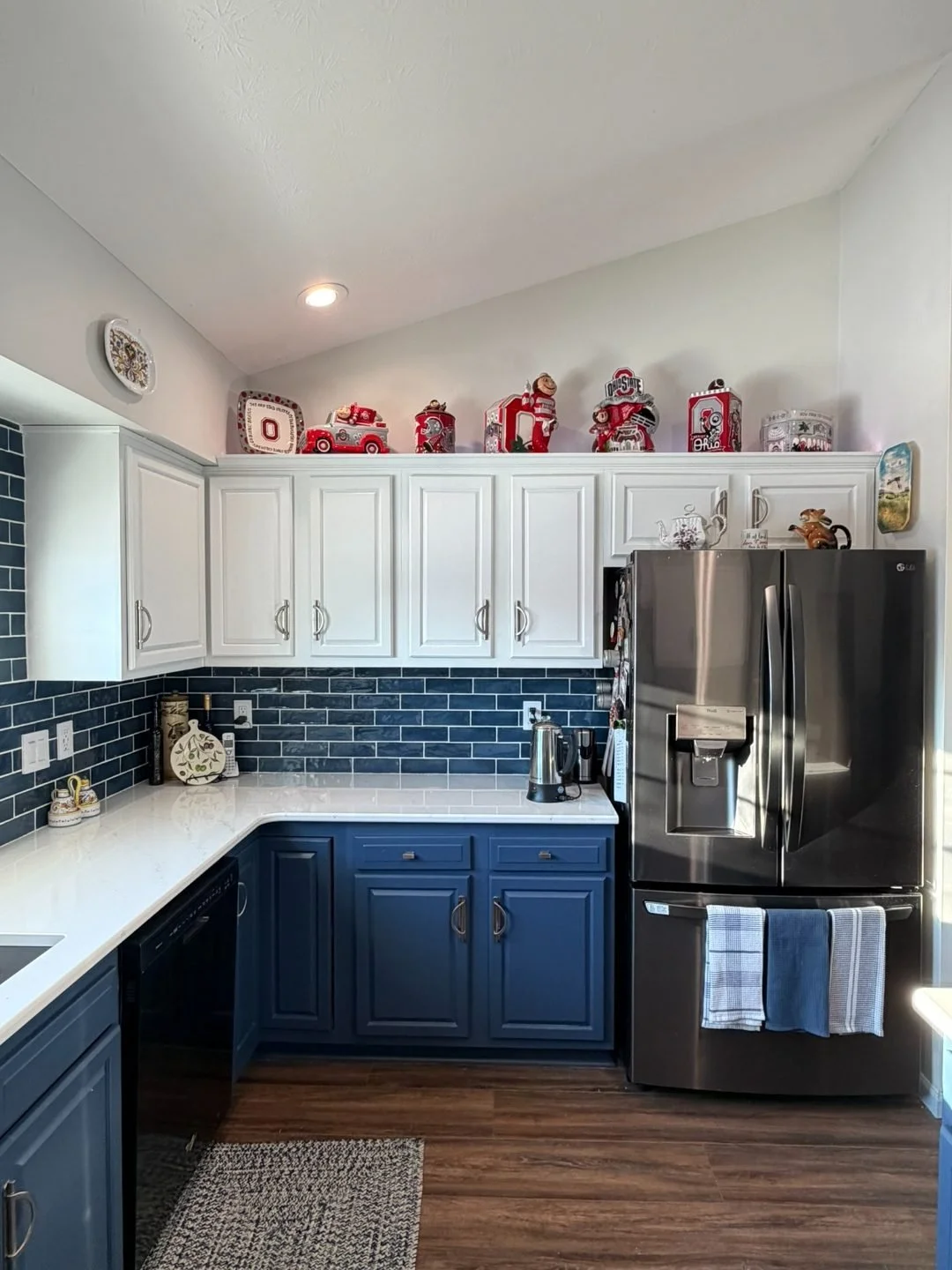
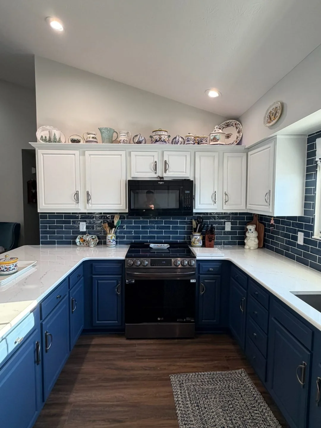
2. Off-White Uppers + Navy Island
Perfect for: Open-concept homes where the island is visible from living areas
Keep perimeter cabinets neutral, then make the island the star with deep navy. The contrast creates drama without commitment — navy holds up great to kids, cooking, and cleaning.
3. Warm Greige Uppers + Charcoal Lowers
Perfect for: Modern Dayton kitchens with gray tones in flooring or counters
Subtle yet sophisticated. Greige (gray-beige) uppers feel current but timeless; charcoal lowers add depth without going full black. Matte black or brushed nickel hardware finishes it perfectly.
4. Cream Uppers + Smoky Blue-Grays Lowers
Perfect for: Cozy kitchens with limited natural light
Soft cream keeps things warm; blue-gray lowers feel moody but not heavy. This works especially well with subway tile, quartz counters, and warm wood accents.
[Insert your two-tone white/green kitchen photo here]
5. White Perimeter + Bold Island (Teal, Hunter Green, or Black)
Perfect for: Entertaining-focused kitchens
The safest way to go bold: paint all wall cabinets white, then give the island its own personality. Teal reads jewel-toned and rich; hunter green feels organic; black is dramatic and hides everything.
[Insert blue island photo here]
How We Make Two-Tone Look Seamless
Two-tone only works when the transitions feel intentional:
Crown molding matches uppers to keep wall lines clean
Toe kicks match lowers for a grounded base
Spray application ensures both colors have identical smooth sheens
Hardware bridges the colors (brass warms up blues/greens; black grounds white/navy)
Our Italian 2K system gives both colors the same factory-quality hand-feel, so the kitchen reads cohesive rather than mismatched.
How to Pick Colors That Work With YOUR Kitchen
Start with what you're keeping (counters, floors, backsplash):
Warm counters/floors (beige, honey oak, creamy quartz) → sage, greige, navy
Cool tones (gray, white marble, dark wood) → charcoal, smoky blue, black
Busy backsplash → calmer cabinet colors
Simple white subway → bolder lower cabinets or island
Quick test: Get two sample doors in your top colors. Live with them under your kitchen lights for 48 hours.
Two-Tone vs Single-Color: The Real Differences
| Aspect | Single Color | Two-Tone |
|---|---|---|
| Visual interest | Flat, predictable | Dynamic, custom-feeling |
| Small kitchen friendly | Can feel boxy | Light uppers open up space |
| Wear patterns | Shows everywhere | Hides on darker lowers |
| Resale appeal | Safe but basic | Modern, on-trend |
| Cost | Same base price | Same base price |
Two-tone gives you more design mileage for the same refinishing investment.
Ready for Two-Tone Cabinets in Dayton?
Two-tone kitchens give you that "just remodeled" look while keeping your existing layout, appliances, and budget intact.
Get a free cabinet painting quote to see how two-tone would look in your Dayton-area kitchen. We'll walk you through color options that work with your counters, lighting, and style — then spray it factory-smooth with our premium Italian coatings.
See our full cabinet refinishing process to understand exactly how we make two-tone look seamless and built-to-last.